DEMOGRAPHIC CHARTS
New Title
Demographic Charts: How to Interpret
INDEX:
A measure of how a given metric compares to an average. In our use, we’re comparing to the average US Internet user. An age index of 100 means a given visitor to our sites is as likely to be the same age as any US internet user.
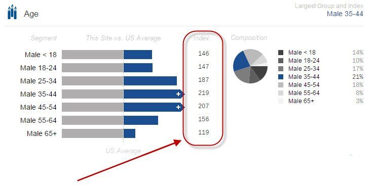
In the example above, our Off-Road sites indexes 187 in Males aged 25-34. This means a given visitor is 87% more likely to be a male between the ages of 18 and 24 as compared to any US internet user chosen at random. An index of 200 means the visitor is twice as likely, 50 means half as likely, and so on. The higher the index, the better the site is at attracting that type of audience.
BAR CHART:
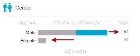
The bar chart reflects visual difference over or under the INDEX. In this example, the blue portion beyond the vertical dashed line reflects the amount over average US internet population. In this example, the Male index is 183, so the amount over the 100 index is reflected in blue.
Likewise, the empty space to the left of the vertical dashed line reflects the amount under the the average index. In this example, the Female index is only 20, well below the 100 index.
COMPOSITION:
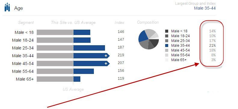
The relative proportion of a site’s audience according to certain demographic attributes. In this example, 21% of the visitors to this group of sites are Men aged 35-44 years of age.
It’s important to compare the composition to the relative index described above. For instance an Index of 200, but a low composition measure is not as important when compared to another metric with an index of 125 and composition of 35%.
SOURCE:
Our demographic data provided is measured by Quantcast through direct site measurement. Learn more about Quantcast here.


© 2024 DigitalThrottle , LLC . All Rights Reserved